Autumn Color Trends 2026: How to Wear the 7 Shades That Actually Work

How to use this guide
These are editorial styling suggestions, not a one-size-fits-all formula. Adapt each look to your wardrobe, proportions, climate, comfort, budget, and the occasion; the most useful idea is the one you can genuinely wear.
First cold morning of the season, you open the closet and everything staring back is black, grey, or the same tired navy. The coat is fine, the boots are fine, the jeans are fine — and yet the whole outfit feels like last year. That is the moment color earns its keep. Color is the cheapest refresh in fashion: same coat, same boots, same denim, woken up by one current shade. If your wardrobe feels stuck between seasons, the fastest way out is not new clothes, it is new color.
This year's seven shades — burgundy and oxblood, mustard, charcoal grey, rust, chocolate brown, olive green, and camel — keep coming back each autumn for structural reasons, not fashion whims: they harmonize with fall light, they flatter the season's fabrics, and they mix with the neutrals you already own. The full fall outfit arc shows how they play across September to November. For each color below: the logic behind it, why it works in autumn specifically, and how to actually wear it without it wearing you.
Burgundy and Oxblood — The Wine Family That Acts Like a Neutral
Burgundy is red with the brightness turned down — deep, wine-dark, warm. It belongs to autumn because it is the color of the season's own palette: turning leaves, dark berries, red wine. That is why it harmonizes with everything around you instead of fighting it. Best of all, it behaves like a neutral: it pairs with black, navy, grey, cream, and camel without clashing, so it slots into a wardrobe you already own instead of demanding a new one.
Wear it with: a burgundy velvet slip dress under a black fuzzy cardigan, grounded with combat boots. The velvet's texture deepens the color, the black keeps it from floating, and the boots keep it in daywear. Or take the simpler route: burgundy as a single piece — a bag, a boot, a sweater — against an otherwise neutral outfit. One burgundy item per outfit is the rule; two is a statement, three is a uniform.

Oxblood, one step darker: the same family taken so deep it is almost black in low light and unmistakably red-brown in good light. That duality is its power — it carries black's authority and red's warmth at the same time, and in matte wool or suede it reads as a near-neutral with hidden depth. It is the most evening-appropriate color on this list, the one that does the most work after dark. Try it as an oxblood patent trench over a black lace cami and dark denim, with oxblood ankle boots: the patent finish does the light-catching work (matte oxblood would be handsome but quiet; patent makes it a statement), so keep everything else dark and simple and let the coat be the undisputed event.
Mustard — Autumn's Warm Accent, and Only One at a Time

Mustard is yellow with earth in it — golden, muted, warm. It is the most literal autumn color there is, the shade of dry grass and late afternoon light, which is why it feels inevitable rather than trendy every time it resurfaces. It works best against cool or neutral surroundings: the warmth of mustard against grey skies, dark denim, or cream layers creates a temperature contrast that makes both sides look richer.
Fabric note: corduroy is what saves mustard from looking flat. A mustard corduroy flare with a cream shearling coat works because the ribbed texture gives the color depth — flat mustard can look one-dimensional, ribbed mustard looks rich. Keep mustard to one major piece per outfit; it is a high-energy color, and it needs quiet companions — white tees, brown boots, dark leather bags — to stay sophisticated rather than loud.
Charcoal Grey: The Power Neutral That Softens Black

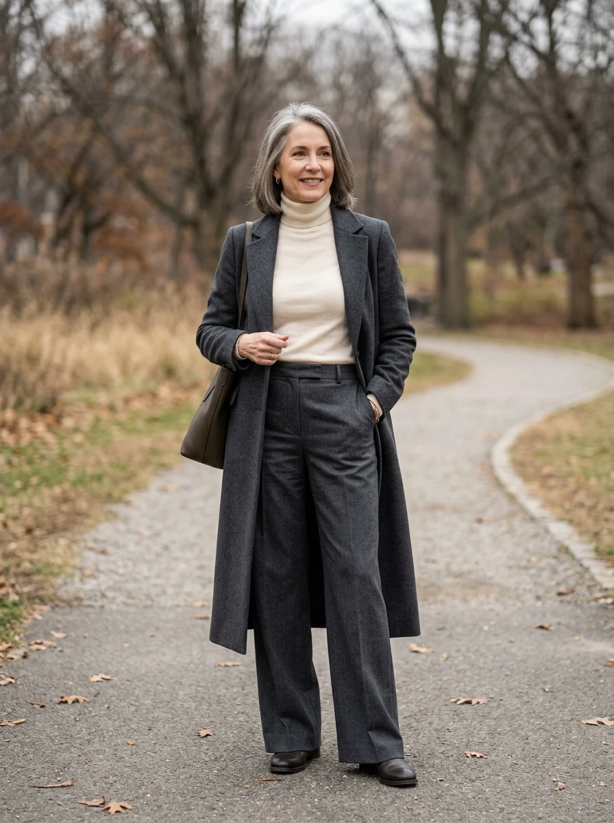
Grey is autumn's most underrated neutral because it does something black cannot: it softens. Charcoal has all of black's authority with none of its harshness, which matters in fall's low, golden light — black can look flat and severe, while charcoal holds depth. It is also the best background color in the wardrobe: patterns, textures, and accent colors all read more clearly against grey than against busier neutrals.
Pairing tip: build the outfit in grey, then add one deliberate accent and let it do all the work. An oversized grey pinstripe blazer with a matching mini skirt, a blue button-down underneath, sheer black tights, chunky loafers: the pinstripe adds the visual interest flat grey needs, the blue shirt adds a cool contrast that keeps the grey from going muddy, and then a burgundy bag or a rust scarf becomes the single accent. That restraint is the heart of old money dressing: neutrals do the talking, and one good accessory finishes the look.
Rust — The Earth Anchor, Even for Skeptics

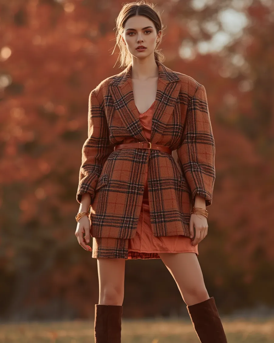
Rust is orange that has been through something — deepened, browned, made serious. It is the color of iron-rich earth and autumn foliage at peak, which gives it an organic quality that brights cannot match. In color-temperature terms, rust is the warmest wearable shade that still functions as a neutral base: it pairs with cream, brown, black, olive, and navy without the visual shouting of true orange.
Wear it with: a rust cable-knit turtleneck over a cream pleated midi skirt, brown knee-high boots. The chunky knit texture is essential — rust in a flat fabric can look flat itself, but in cable knit it has dimensionality. The cream skirt keeps the overall effect soft; the brown boots ground it in the season. And rust is the easiest "trend color" for skeptics: it feels like an autumn staple rather than a fashion statement, because it essentially is one.
Chocolate Brown: The New Black, and Why the Light Agrees

Chocolate brown has been steadily displacing black as fall's default dark neutral, and the reason is light: in autumn's warm, low-angled sun, brown glows where black absorbs. It is softer against skin, richer in texture — brown shows weave and nap in a way black hides — and it harmonizes with the season's entire palette. Camel, rust, burgundy, cream, olive all sit naturally beside it, and monochrome brown dressing works because tonal variation within one rich color creates depth without needing contrast.
Fabric note: go head-to-toe chocolate — a satin midi dress under an oversized wool blazer in the same deep brown, brown loafers, gold accents. The trick is varying the textures (satin's sheen against wool's matte) so the monochrome has dimension; the same color on a different surface is what keeps tonal dressing from going flat. Gold jewelry is the natural metal pairing: silver fights brown's warmth, gold amplifies it.
Chocolate carries straight into cold weather, and these flattering winter outfit ideas show the same tonal browns layered under coats and boots.
Olive Green — The Quiet Statement

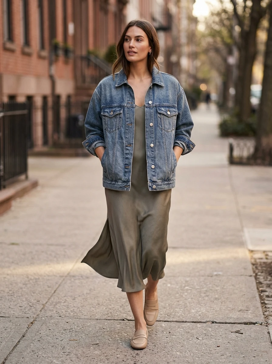
Olive is green with the brightness removed — muted, earthy, endlessly wearable. It works in autumn because it is the color of the season's transition: the last green before everything turns brown. Unlike brighter greens, olive behaves as a neutral, pairing with cream, white, tan, brown, black, and navy. It is also one of the few colors that flatters nearly every skin tone, because its mutedness means it does not compete with the wearer.
Wear it with: an olive suede shacket over a cream ribbed turtleneck, white wide-leg trousers. The suede texture deepens the olive — flat olive can read as military surplus; sueded olive reads as luxury — and the white trousers are the counterintuitive masterstroke: the crisp lightness against the muted green makes both look more deliberate. This is the outfit that proves you do not need dark colors to dress for autumn; sometimes the softest palette is the most sophisticated.
Camel: The Quiet Classic That Makes Everything Else Look Expensive
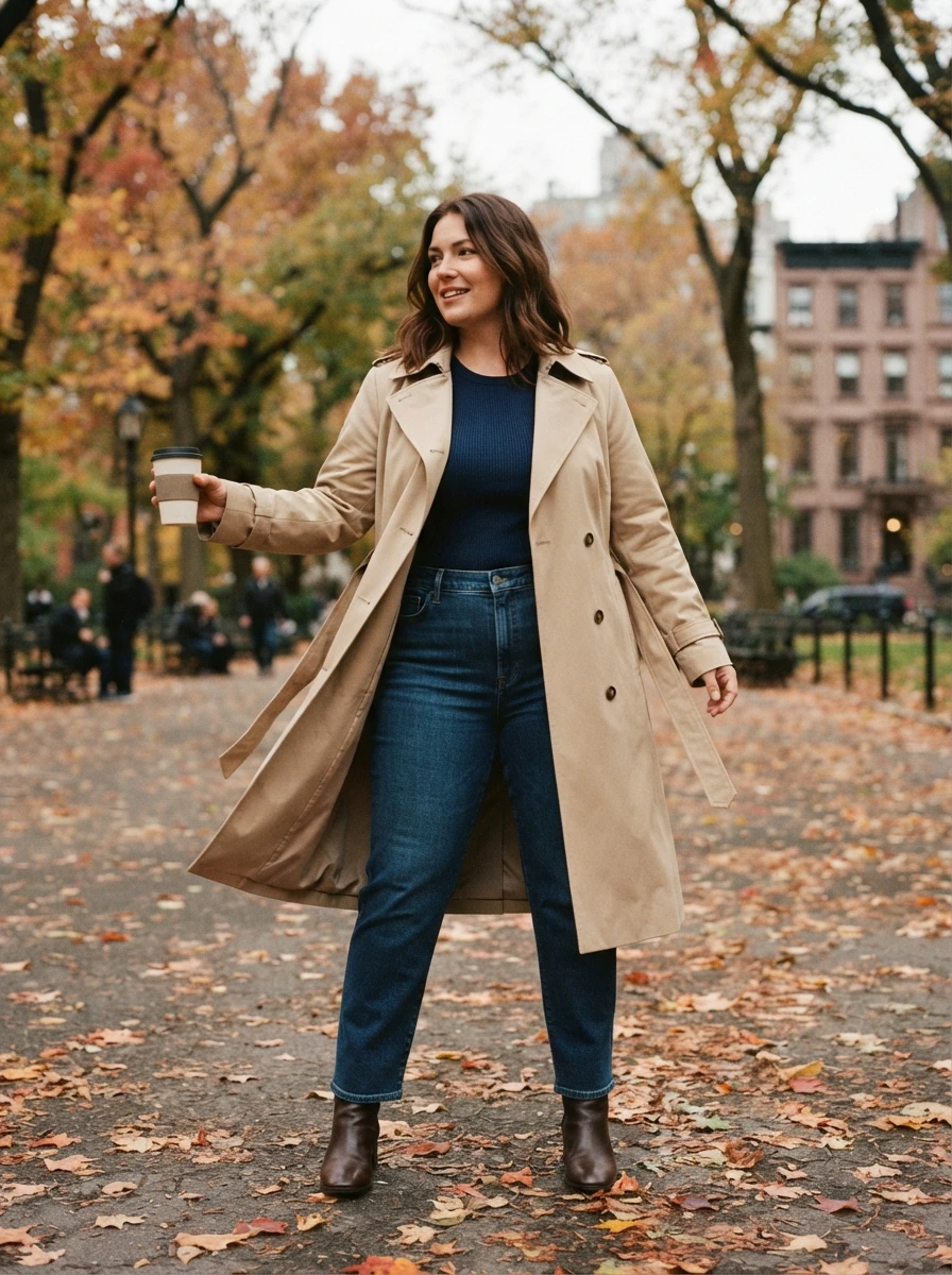
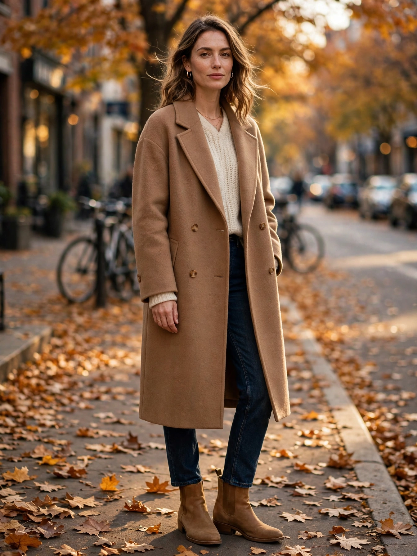
Pairing tip: camel is the warm tan between cream and brown, and it is the oldest autumn neutral there is. It flatters every skin tone because it is warm without being loud, and it makes every color on this list look more expensive: burgundy turns richer beside it, rust turns softer, chocolate turns deeper. A camel coat is the single autumn purchase that never dates, which is why the shade returns every year without needing a trend cycle to justify it.
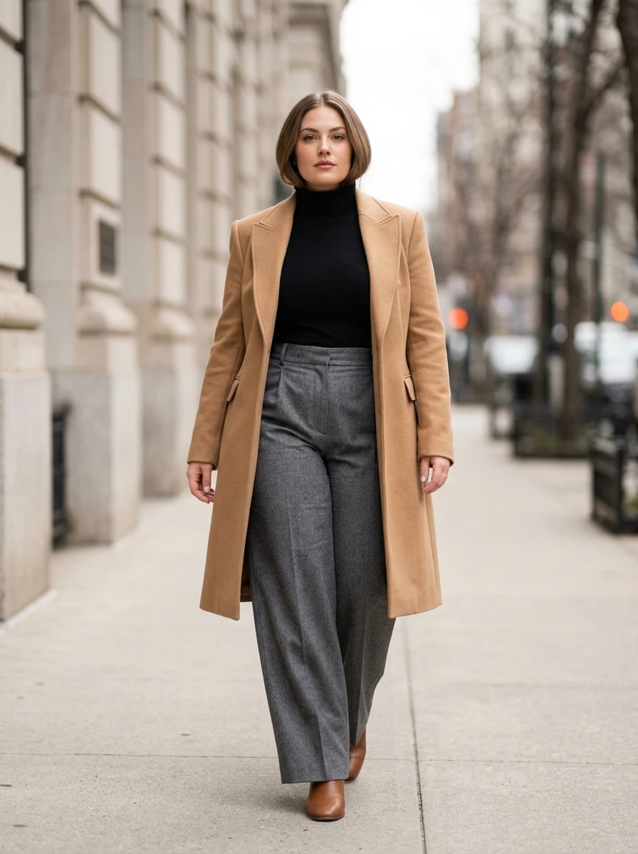
Wear it with: a camel wool coat over a cream knit and dark denim, tan leather boots, gold jewelry. Keep the layers underneath simple so the coat carries the outfit, and let one darker piece — a burgundy bag or chocolate boots — anchor the palette. Camel also works as the quiet partner in this guide's bolder sections: a camel scarf calms a rust knit, and camel trousers ground a mustard sweater without dulling it.
How the Seven Colors Pair Up
| Color | Pair it with | Keep it away from |
|---|---|---|
| Burgundy and oxblood | Black, navy, cream, camel | Bright red, hot pink |
| Mustard | Dark denim, cream, brown leather | Neon yellow, cool grey |
| Charcoal grey | Burgundy, rust, blue, white | All black, which looks flat |
| Rust | Cream, brown, olive, navy | True orange, electric blue |
| Chocolate brown | Camel, cream, gold, burgundy | Silver jewelry, stark white |
| Olive green | Cream, white, tan, black | Bright green, neon accents |
| Camel | Burgundy, rust, chocolate, cream | Cool pastels, silver grey |
Frequently Asked Questions
Which autumn color should a beginner start with?
Burgundy and chocolate brown. Both behave like neutrals, so they slot into a wardrobe you already own without new shoes or bags. Start with one piece — a sweater or a bag — against black, navy, or cream, and add a second color only once the first feels natural.
Can burgundy and oxblood share one outfit without clashing?
Yes — they are one family, so they layer tonally instead of clashing. Vary the texture (matte wool with patent leather, suede with velvet) so the two wine tones read as depth rather than one flat block. Keep everything else neutral and let the wine shades do the talking.
Which of these shades suit warm skin tones best?
Rust, mustard, and camel. All three carry golden undertones that warm up the complexion instead of washing it out. If mustard feels too loud near your face, wear it as trousers or a bag and keep a cream or camel layer at the neckline.
How many trend colors can one outfit hold?
One lead color, with everything else neutral. The fastest way to misuse autumn's palette is to wear three trend colors at once, which reads as a costume rather than an outfit. Pick a lead, add one accent at most, and let restraint do the styling.
Which autumn color is safest for the office?
Charcoal grey, chocolate brown, and camel. All three read as polished neutrals in tailored cuts, and they pair with the white shirts and dark trousers an office wardrobe already holds. Save mustard and oxblood patent for evenings and weekends, where their drama belongs.
Your Autumn Palette Checklist
The season's official direction backs this up: Pantone's Autumn Winter 2025/2026 report lists Hot Chocolate, Bronze Brown, and Winterberry among its ten standout colors, so the browns and wine tones in this guide are the same ones the runways wore.
- Pick two, not seven. Choose the two shades that speak to your existing wardrobe — black-and-navy wearers start with burgundy and charcoal; denim-and-cream wearers start with rust and olive.
- One lead color per outfit. Everything else neutral; one accent at most.
- Keep the temperature warm. These seven are all warm or warm-neutral — mixing them freely is safe, but cool brights (electric blue, hot pink) clash.
- Texture before more color. If a shade is not working, try it in velvet, corduroy, suede, or cable knit before giving up on the color — flat fabrics flatten color.
- Restraint is the styling. One color story per outfit; let the lead shade do its job instead of shouting over it.
Two shades, one lead, warm temperature, textured fabric, and restraint — that is the whole system. Build the palette around what you already own and autumn color stops being a trend to chase and starts being the easiest refresh in your closet.